Ep. 34- You, the Designer
Design for the rest of us

Announcement: I invite you to join our next Ideacraft cohort starting Friday, January 12th. Ideacraft now includes two ways to study- working with me through weekly recorded critiques (many of which you can attend in real time) and a cohort of other creative geniuses or taking it without recorded feedback. Learn to design pictures that speak louder than words.

You, the Designer
When I was young, I thought of a designer as someone who worked in layout and typography. I wanted to draw pictures and I missed the connection between the disciplines of design and illustration. What I’ve come to realize is that design is a universal and ubiquitous language that attempts to bring order to the world around us. Design is our best attempt to bring the awe of the universe into human scale. Everything that you see and touch that is not of the natural world (which is meant to include God) has been conceived, created, designed and made by humans for humans. (I realize there is a caveat here with machines used in manufacturing, as well as the rise of AI, but it remains true that humans have been the catalyst behind all of this work.)
We are all inherently designers. In my path to understanding design, a key principle in design is to make one comfortable in space. Whether it’s a two-dimensional page, or a three-dimentional living room, we organize the elements around us to suit our interests, needs, desires and comfort.
Look at the space around you. Are necessary things within your reach? The furniture organized to serve a purpose? Next time you go out to dinner, your plate, silverware, food, drink and the company you keep, are all designed to be functional and comfortable so that you can enjoy your meal.
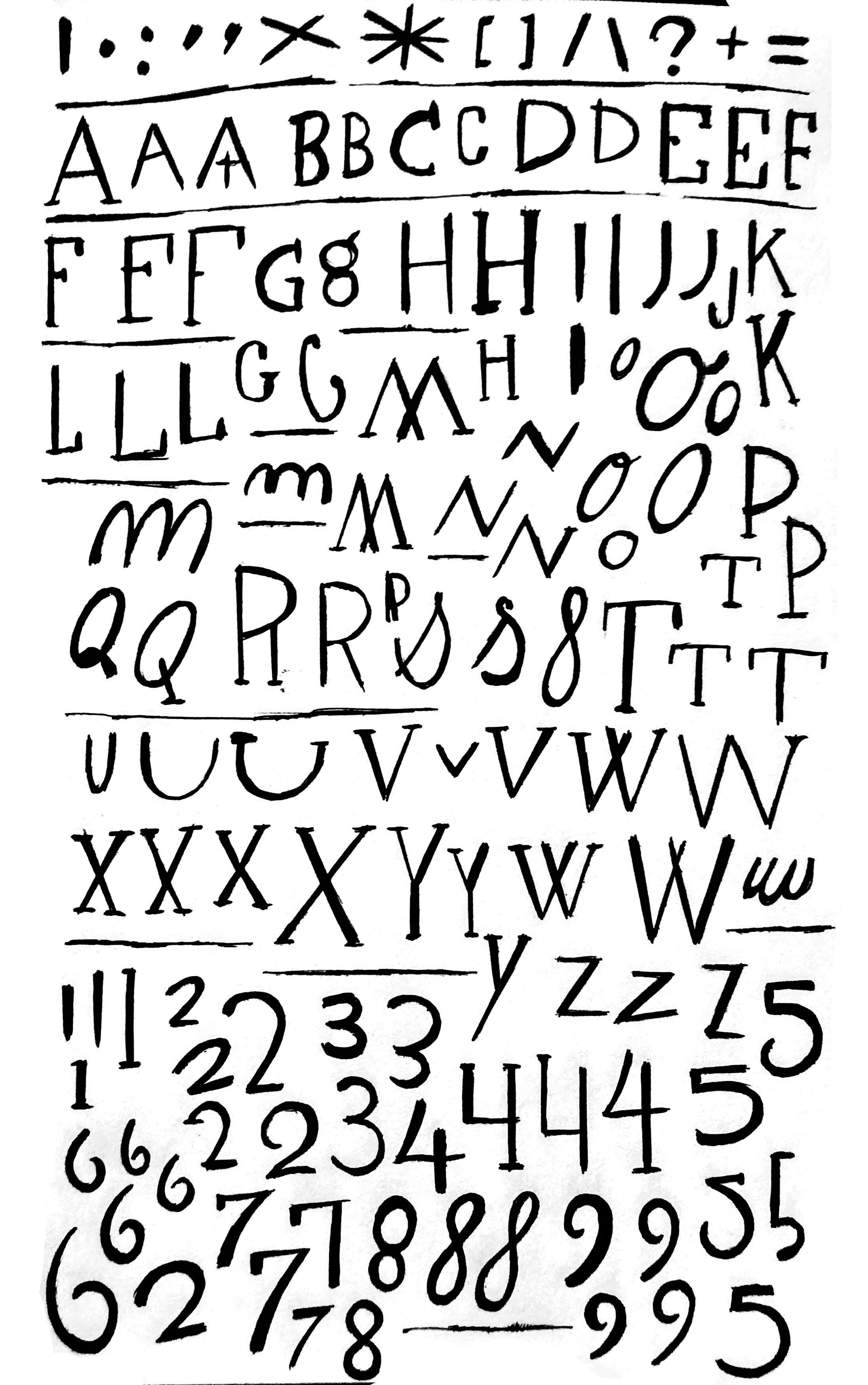
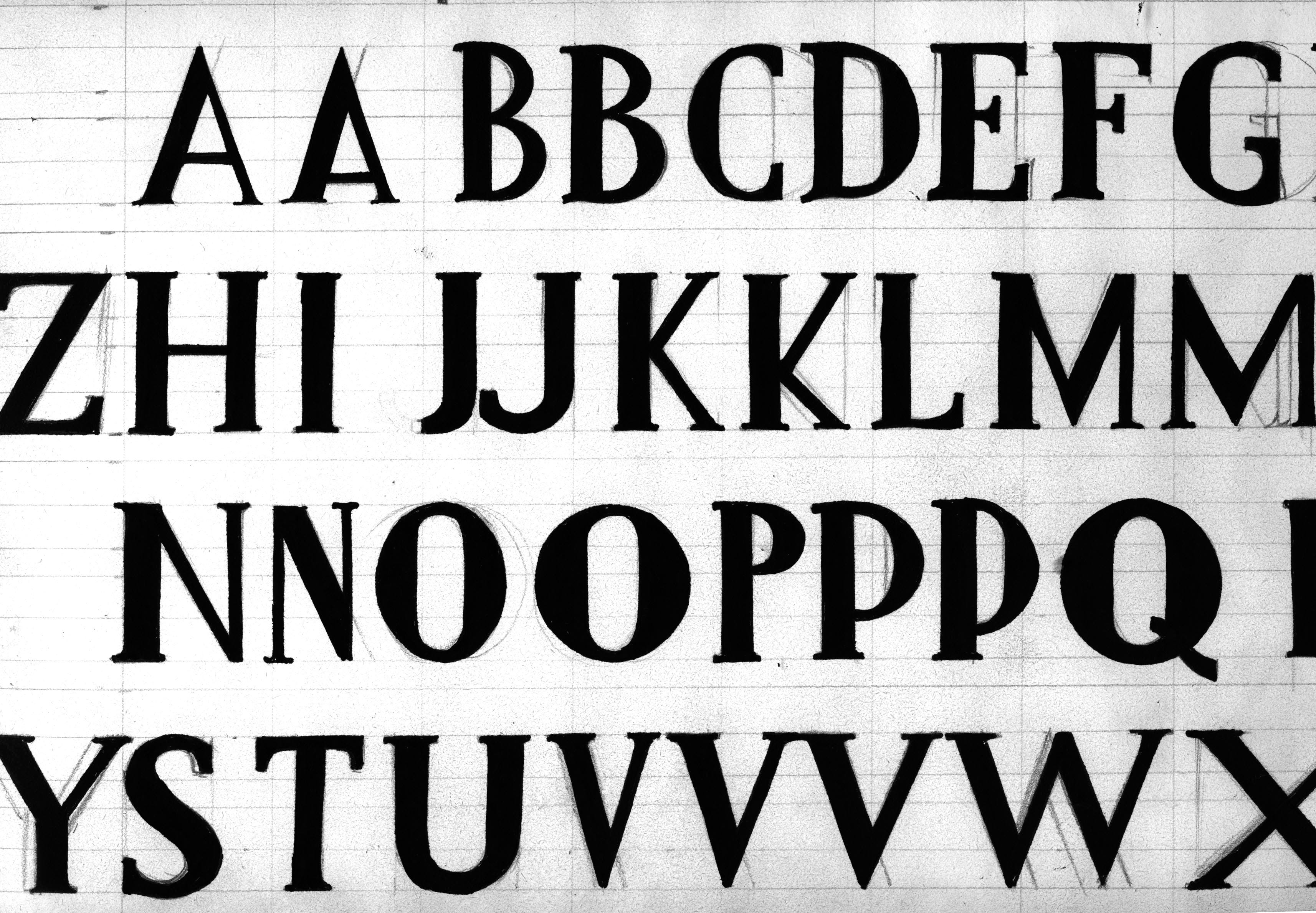
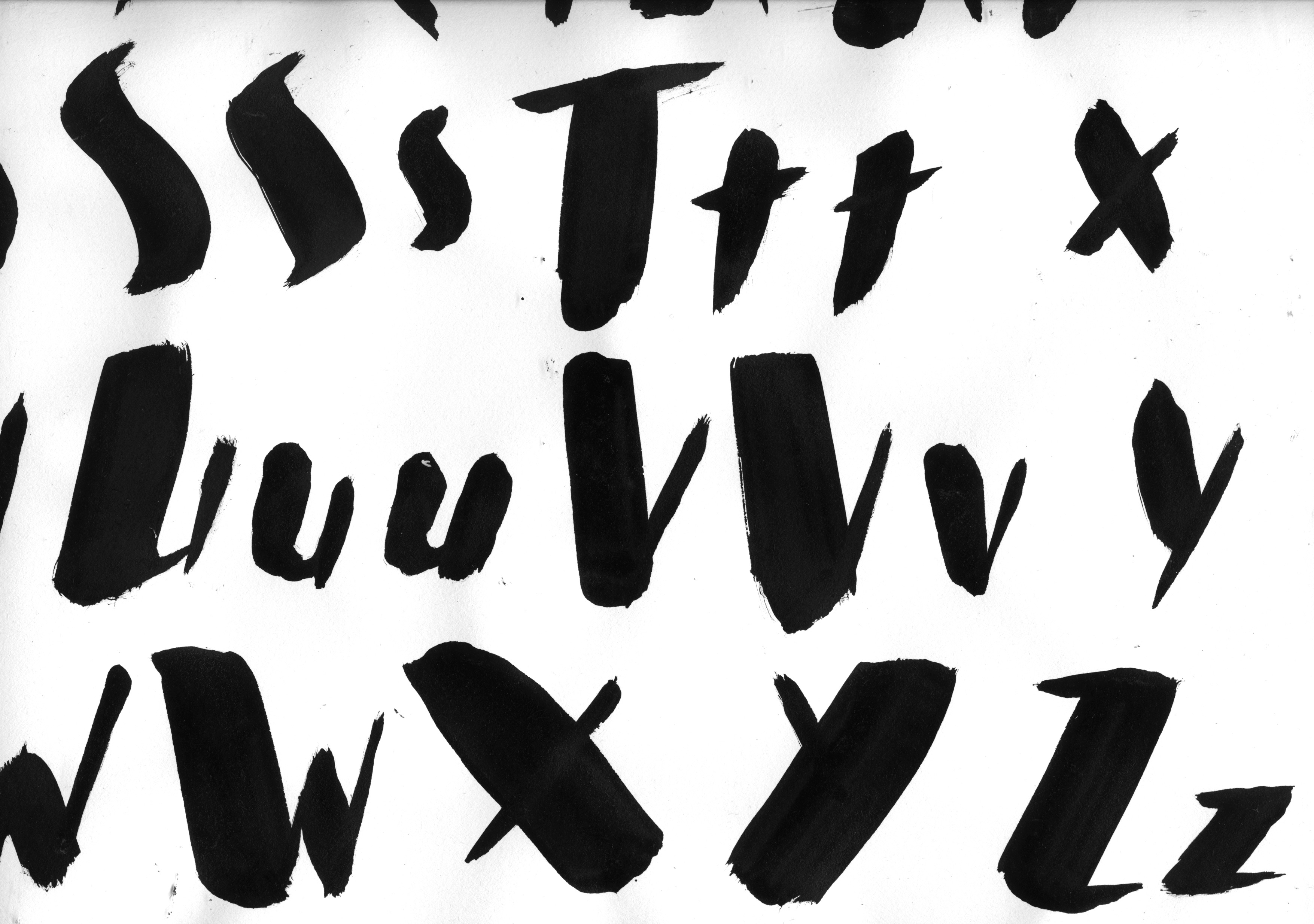
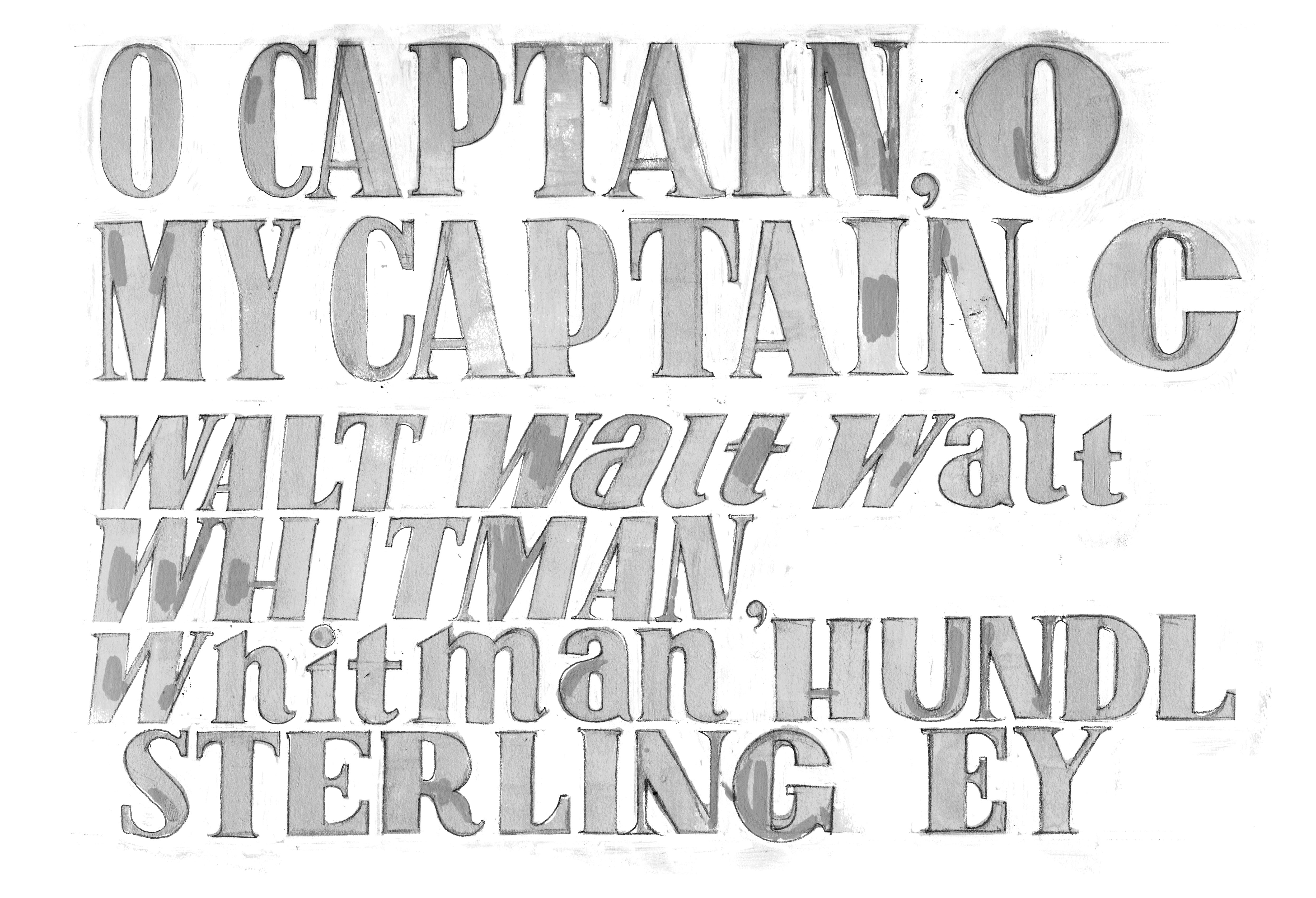
I was unimpressed with my design professor in art school. He provided little information on how to improve or even understand the work of students. The answers so cryptic that they confused more than they clarified. What I’ve learned of design, I’ve had to teach myself through trial and error. My understanding of typography began with my first job working at an airbrush stand at the local theme park. Not exactly the pinnacle of high taste, but damn if I didn’t love my job there. Even at sixteen, I was determined to have the best freehand script in the airbrush booth- big ambitions. I began studying fonts, drawing entire alphabets in my sketchbook. My journal entries were written in these fonts and both my handwriting and my understanding of typography improved dramatically in a short period of time. These days, I feel that I can copy three to four letters from a typeface and understand the rules the designer established in the creation of the font. Once I know this, it becomes much easier to understand the function, application and nuances of that particular typeface.
Once I found the connection between illustration and design, exploiting tangents, defining my own underlying armature that mirrored the grid system that defines so much of layout, and the role of positive and negative space, I was emboldened to push the limits of both concept and composition. Today, I identify more as a designer who illustrates than an illustrator.
Though I did go through art school, as well as finding wonderful, specialized training through the Illustration Academy, I relate to artists who never had the benefit of going to art school and struggle with the insecurity on what they’ve missed. As a Professor, I do my best to pull back the curtain on Academia to dispense with the pretense that is often found in ivory towers. As I tell folks, you don’t know what you don’t know. What I’ve come to realize is that for all of the rules that govern design, illustration and visual communication, you are ultimately looking to find your own preferences in how you approach solving problems. You want to get to a place where you have the confidence that you can figure it all out. This can only come from doing. This confidence is earned and once you find it, it will carry you through the insecurities of not knowing. I developed the language and thinking below so that I could understand design, as well as teach it in a simple and easy-to-understand way. That is to say, this is how I would teach design to my younger self. I hope that through this reframing of language, I’ve decoded a bit of the mystery around design and I’ve provided a logical series of choices to assist you along the way.
Below are principles of design that I have observed that have helped me tremendously in my approach to design.
Design is a process of simplification.
Two-dimensional design for the page is an interpretation of three-dimensional space, i.e. reality.
Through design, you are looking to either activate or deactivate space. If the image or physical space feels congested and busy, remove something. If it feels sparse and void, add something. If the thing you add activates the space, helps communicate the story and adds visual interest- 100% keep it. If it doesn’t do all three of these things, consider getting rid of it. Less is more, as the age-old wisdom goes.
Design is organized on a grid. The grid is invisible but felt through the interconnection of words, images, and negative space. Edges align, and values are grouped to create order.
In illustration, the errant strokes and guess lines that unify the underdrawing serve the same purpose as the invisible grid in design. Look for lines of action, and positive tangents where things in the foreground, background and middle ground reference each other.
Design often occurs in threes. Big, Medium, Small. Lights, Midtones, Shadows. Foreground, Middle Ground, Background. This three-stepped approach allows us to establish the outer edges of our understanding of fundamental elements and gives us a middle ground of comparison between them. This is not binary, it is triary.
Everything is relative. Through the act of drawing a box to define your composition, you create both positive and negative forms. Everything within the composition matters. Nothing outside the composition matters.
Negative space is as important as positive space.
Think of page layout as an interpretation of 3-dimensional space. If your elements are pieces of furniture, organize them in such a way that the viewer can traverse the space from the top left to exit on the bottom right. Get your Fung Shui right on the page and you’ll create an inviting space for someone to hang out.
In design, hierarchy is a proxy for time. Hierarchy is the deliberate organization of dominance in visual communication. Through hierarchy, you are saying look here first, here second, here third. Through this, you are walking someone through your composition in a curated sequence that delivers information in the order of your choosing.
There are many time-tested principles related to design. Those that I have added here are my additions and interpretations that allow for a simpler understanding of type and design principles.
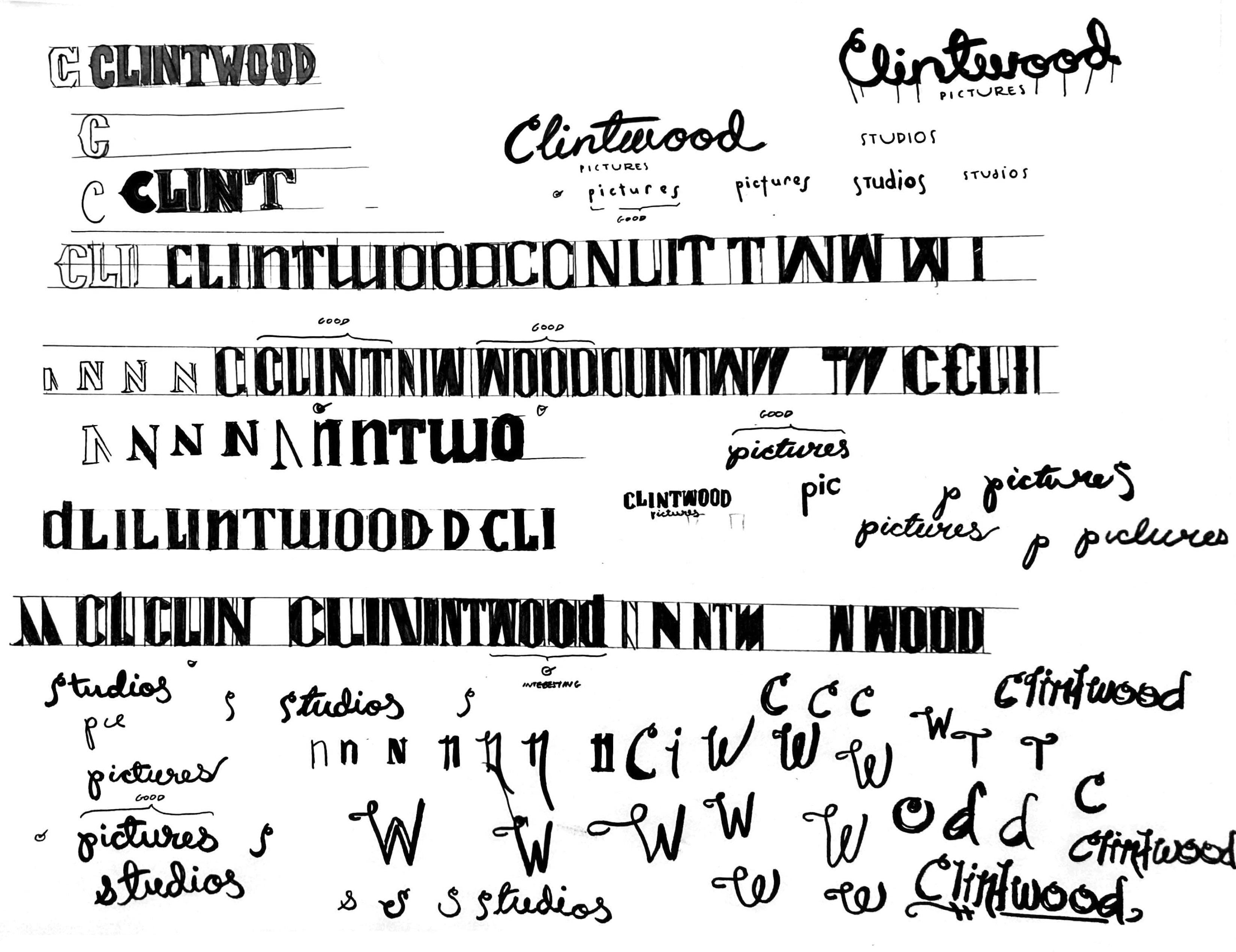
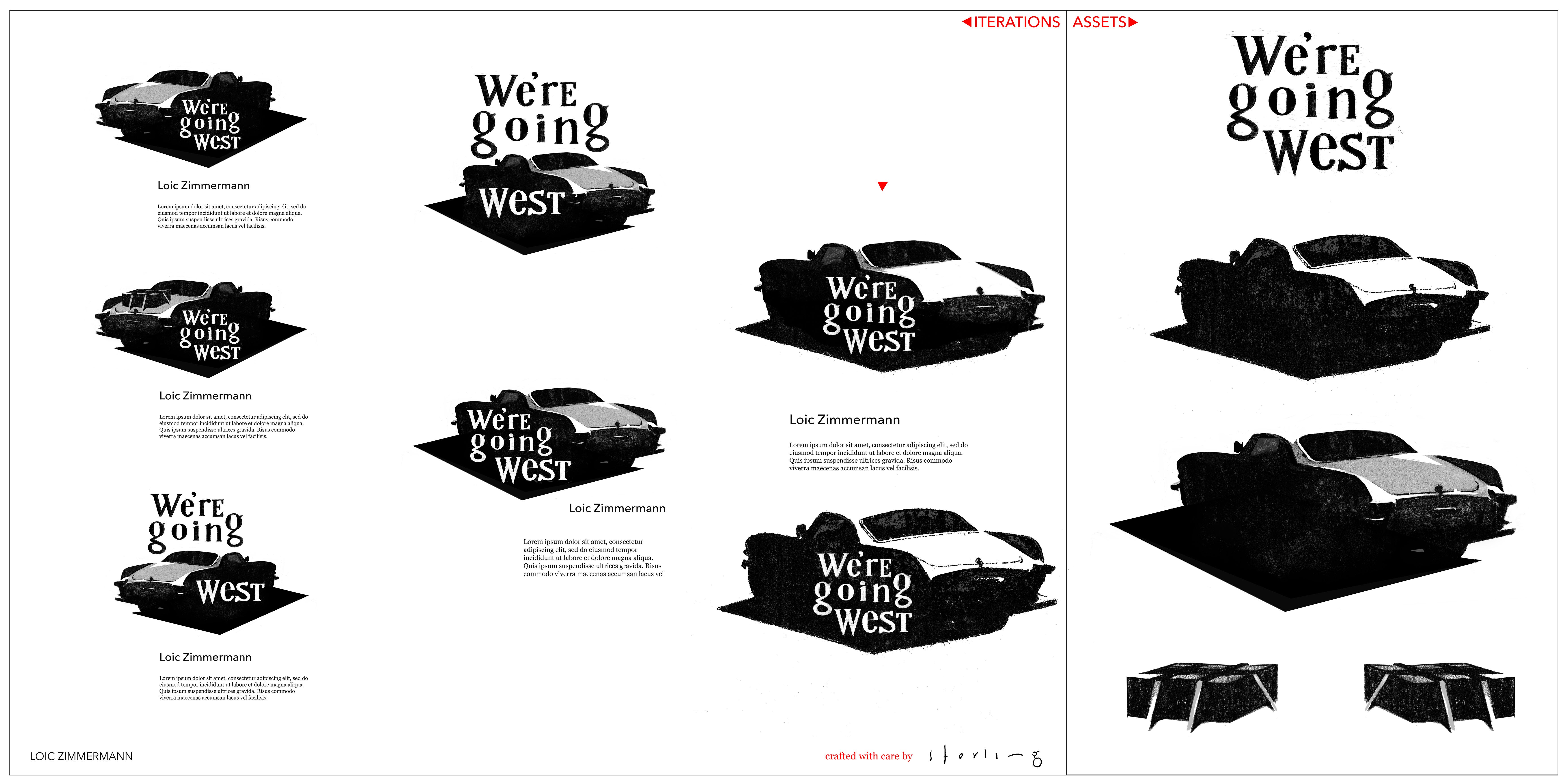
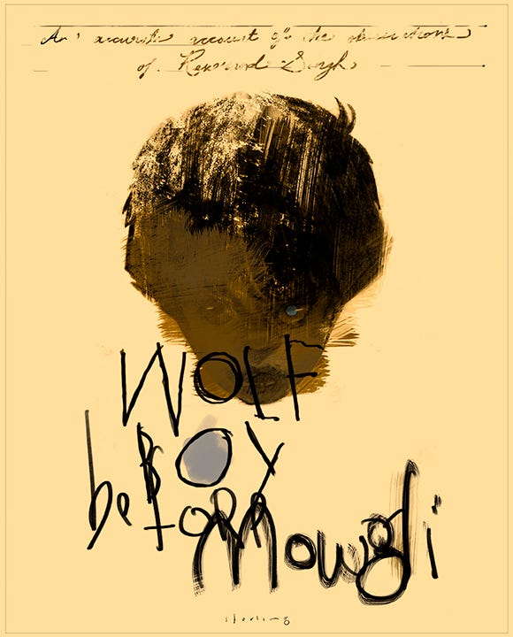
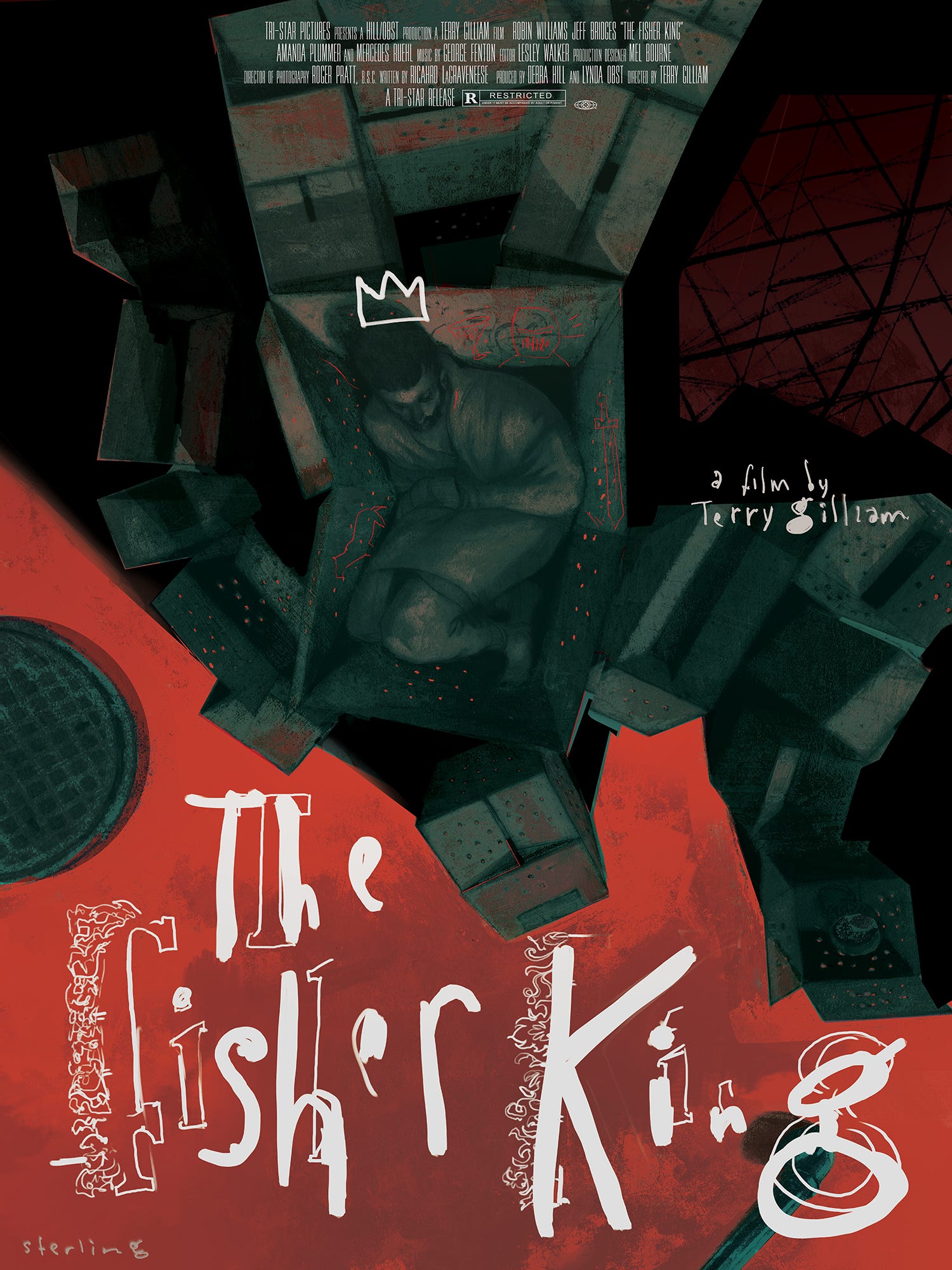
A few projects and fonts I’ve flirted with over the years: